Branding & Identity Design
Visual Identity - Branding
Kellua Wellness is a mobile sauna business with an incredibly unique selling point: Its a sauna built out of a repurposed horse float.
They are a new brand, and needed an identity to help them stand out as much as their float will.
Visual Identity - Branding - Creative Direction
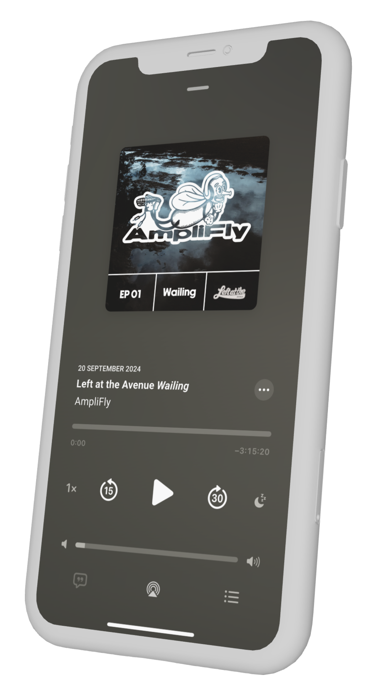
AmpliFly is a podcast focusing on new and emerging Melbourne music and artists. What sets AmpliFly apart is the focus it has on the technical construction of music, delving deep into the inspiration and components that make up a song.
This is a young brand whose audience is deep into the Melbourne music and sound engineering scene and the brief called for something fresh and iconic to set it apart from other podcasts on the market.
Visual Identity Design - Branding - Collateral
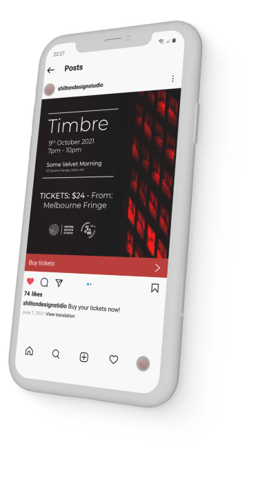
Shilton Design Studio: Sustainable Furniture, Crafted with Care
Shilton Design Studio is a Naarm-based boutique furniture studio specialising in meticulously handcrafted pieces, each built from eco-friendly materials and tailored to the client's vision. The design approach for this studio is based on the organic and eco-conscious values of the business, utilising flowing organic shapes contrasted by a sharp and clean typeface to showcase the roots of the business and their commitment to quality.
Visual Identity - Branding
The Aware Project was a mental health awareness initiative focusing on breaking down the stigma of mental health for young people in Australia. With a goal of facilitating constructive and healing conversations about mental health and other issues impacting young people.
Visual Identity
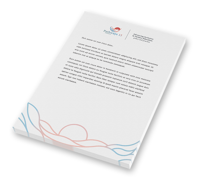
Pathways is a conference for disability practitioners, academics, researchers, National Disibility Coordination Officer’s, students with disability and those with an interest in addressing barriers for people with disability participating in tertiary education, training and subsequent employment.
Pathways 15 was to be hosted in Darwin and needed a unique brand and logo-mark to distinguish it from previous conferences. The brief called for a mark that expressed the unique identity of Darwin, particularly connection to nature, the ocean and the profound natural beauty of the area. The resulting logo-mark is a condensed representation of these three elements, showcasing iconic Darwin sunset over water, as well as the iconic brolga taking flight.
Brand Refresh
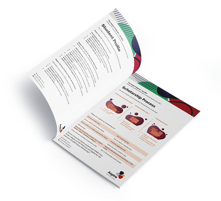
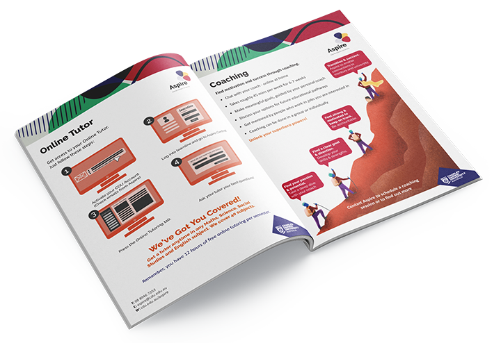
Aspire (Now known as Team Aspire) is a project run by Charles Darwin University that works to (in their own words) facilitate age-appropriate opportunities for Northern Territory school students to repeatedly connect with the horizons of higher education, possible careers and life-long learning.
The team approached me needing help updating their branding to align with the guidelines set by Charles Darwin Uni. The outcome of this project is a logo-mark that aligned with the parent-brand of the university, while also creating a unique identity for the team and project.
Place Branding - Marketing Campaign
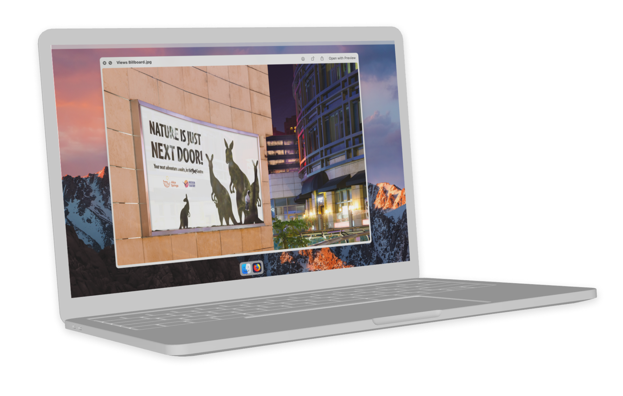
The Alice Springs place branding project was a university assignment completed in 2018. The draw card for Alice as a destination for locals and travellers alike is its proximity to nature, and the access to continuing stories and culture from First Nations People.
Using the instantly recognisable landmark of Mount Gillen as the foundation for the logo mark was a no brainer. This peak can be viewed from almost anywhere in the town, and can be seen for many miles in the bush - simply put it is a landmark that ties the town to its surroundings perfectly.
