Branding and Identity Design
Kellua Wellness is a mobile sauna business with an incredibly unique selling point: Its a sauna, inside a repurposed horse float.
Stripped down and rebuilt out of recycled timber from demolished houses, this is a business built with care, expertise and the environment in mind to create a holistic wellness service, on wheels!
Year
2024
Client
Kellua Wellness
The Process
The design approach for this project needed to encapsulate the care and commitment that this business represents, not only to craftsmanship but also to the natural world.
Creative Direction
An essential component of any branding project, this step helps align both client and designer on what creative direction will inform the design choices.
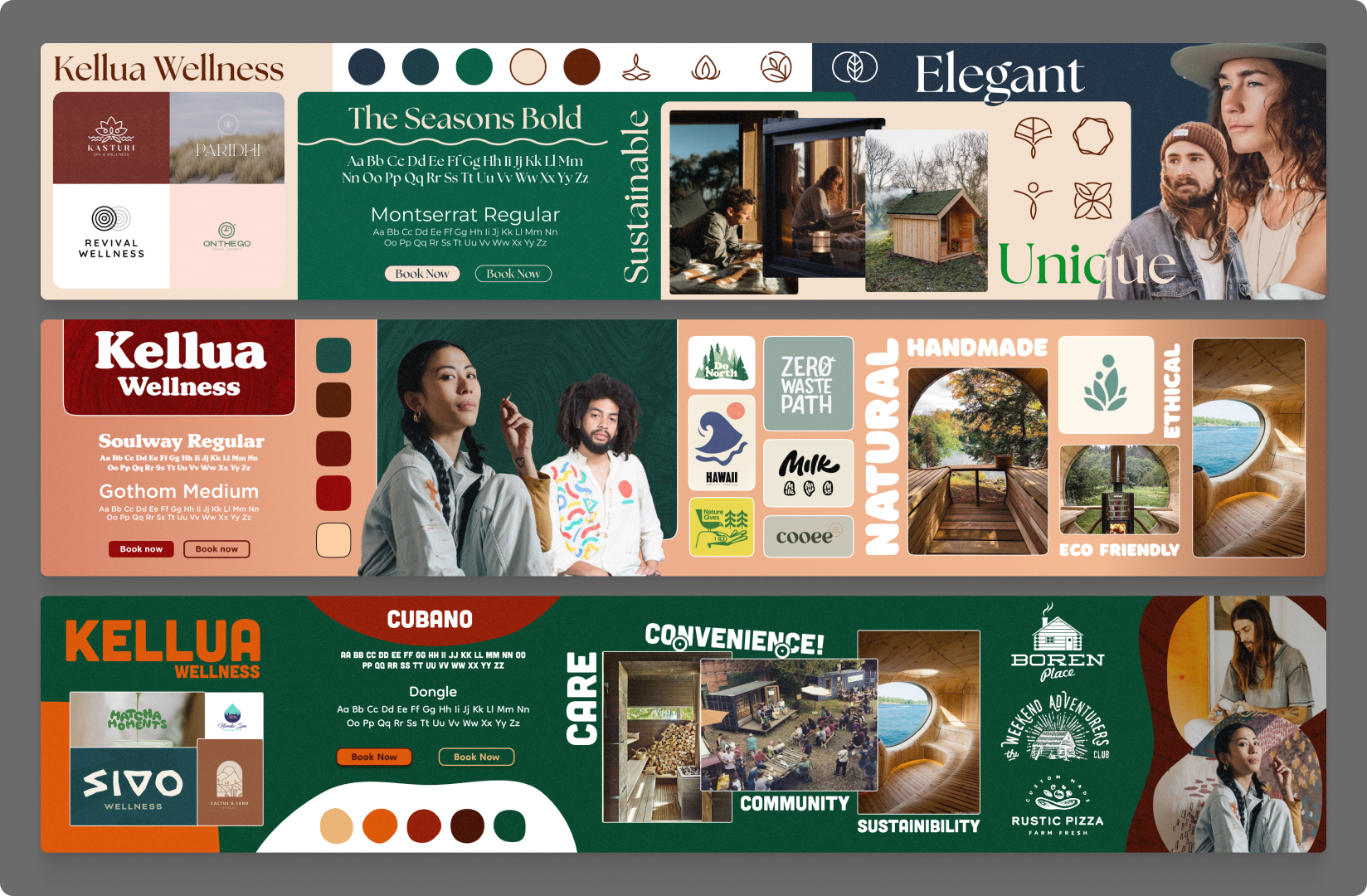
Kellua were presented with three directions, based on research and inspiration conducted around the industry and the consumers. This step has two intentions: One, establish what design influences will shape the identity, and two, to challenge the client’s assumptions and ideas about what their brand looks like and represents.
In this instance, through collaborating with the client, we came away with a design direction that married concepts from across the directions. Clean elegant typeface from direction 1, photo styling and audience from direction two, and rustic, natural marks from direction 3.
Concept Development
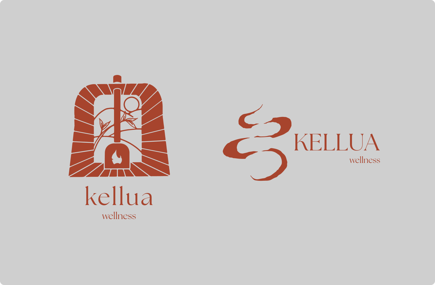
The client received two concepts for this project.
Concept 1 is an illustration based mark, using the silhouette of the horse float to frame a natural scene, tying together the relaxation and connection to nature a mobile sauna can provide, relaxation with any view.
Concept two uses abstract shapes to create a sense of movement and calm. Using stacked sauna stones in negative space to highlight the steam and heat of a sauna, creates a balanced mark that communicates the harmony between fire and water that is the foundation of the sauna experience.
Outcome
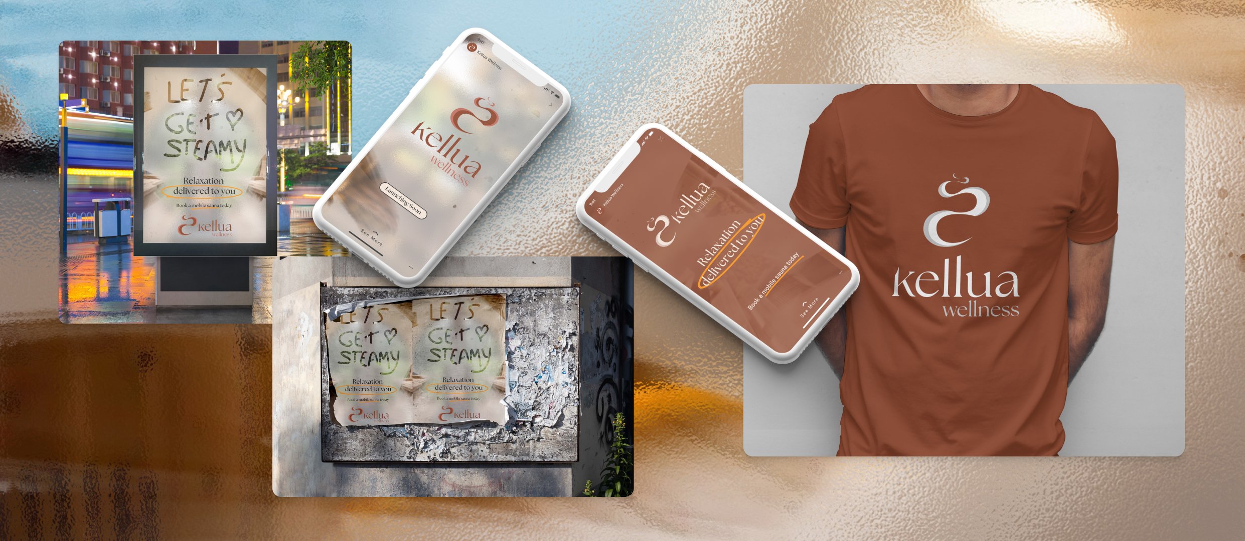
Putting together the finished design means taking on client feedback, and reworking the design to ensure it fits with their vision.
In this instance, the steam was getting lost in the original concept, so to solve this I came up with a two tone approach to add a feeling of depth and transparency to the shape.
The form also needed to be reworked slightly in order to emphasise the movement and to increase the contrast between the physical mark of the steam and the negative space which forms the stacked stones.
In the end we are left with a clean mark that shows gentle dispersing motion of steam, on the solid structure of sauna stones.
